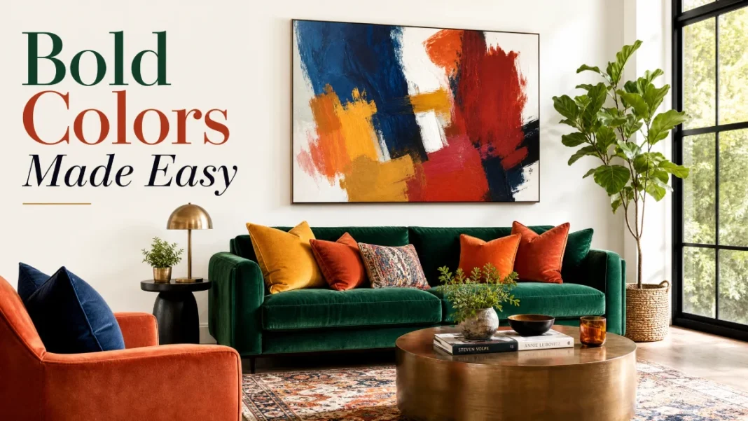
You’ve saved dozens of jewel-toned living rooms on Instagram. You’ve hovered over a deep emerald paint chip at the hardware store. And then you walked away. Bold colors feel like a gamble — and when you’re not sure it’ll pay off, the safest move is to stick with greige.
I get it. I’ve stood in clients’ homes watching them fall in love with a bold hue, then talk themselves out of it in the same breath. But here’s the truth: bold color isn’t the enemy of a calm, pulled-together home. When you use it with a little know-how, it’s one of the most affordable ways to make a room feel custom, layered, and quietly luxurious.
This guide covers the myths that hold you back, the dos and don’ts that keep things controlled, and a room-by-room playbook you can act on this weekend — all without a single designer on speed dial.
3 Big Misconceptions About Bold Colors
Myth 1: Bold colors shrink a room.
Reality: A deep wall color can actually blur the corners and make a small space feel larger and more intentional. When you paint a powder room in a rich charcoal blue, the walls recede visually. The room doesn’t feel smaller — it feels cozy and intentionally finished.
Myth 2: You need a designer’s eye to pull off bold color.
Reality: You just need a simple set of ground rules. Stick to one or two bold moments, ground them with neutrals, and test your choices in the actual light of the room. That’s exactly what designers do — only now it’s in your hands.
Myth 3: Bold means loud and overwhelming.
Reality: Bold doesn’t have to shout. Muted bold tones like terracotta, olive green, and deep navy act more like neutrals with personality. They add depth without exhausting your eyes.
The Dos and Don’ts of Using Bold Colors
Do
An accent wall is the lowest-commitment way to welcome bold color. Choose the wall that naturally draws your eye — the one behind your bed, the back of a bookshelf alcove, or the wall opposite the entry door. Paint it in a saturated hue like Benjamin Moore’s Hale Navy or Farrow & Ball’s Inchyra Blue, and keep the surrounding walls a soft, warm white. You’ll get all the impact with none of the overwhelm. For renters, peel-and-stick wallpaper delivers the same effect without touching the walls.
Don’t
A room with a red sofa, a teal accent chair, and a mustard rug is a room at war with itself. Stick to one or two bold players in a single space. If your sofa is a showstopping emerald velvet, let the walls, rug, and art stay quieter. Think of bold color like salt — just enough elevates everything; too much ruins the dish.
Do
This interior design classic works beautifully with bold colors. Let 60% of the room be your dominant neutral (walls, large upholstery), 30% a secondary color (drapes, accent chairs, a feature wall), and 10% the boldest accent you love (throw pillows, a piece of art, a lacquered side table). This formula gives bold color a clear job instead of letting it take over.
Don’t
A color that glows in a sun-drenched showroom can turn muddy in a north-facing room. Bold, cool tones like deep teal or charcoal can read as cold without enough natural light. In darker spaces, lean toward warm bold colors — think rust, ochre, or a warm plum — and always test first (more on that in a moment).
Room-by-Room Bold Color Guidance
1. Living Room
An accent wall or a bold sofa usually makes the biggest impact here. If you go with a jewel-toned sofa, keep the walls light and the rug neutral. If you prefer painted drama, try a deep olive accent wall behind the sofa and bring in cream and wood tones everywhere else.
2. Bedroom
This is the room to go bold on all four walls. Deep, moody colors like Farrow & Ball’s Hague Blue or Benjamin Moore’s Wrought Iron turn a bedroom into a cocoon. For maximum impact, paint the ceiling and trim in the same hue — the technique, called color drenching, makes the walls feel endless. Balance the dark walls with crisp white bedding, a light rug, and warm metallic bedside lamps.
3. Kitchen
Bold color loves cabinetry. An island in navy blue or a run of lower cabinets in sage green gives the kitchen personality without overwhelming it. A matte or satin finish keeps painted cabinets looking refined. Keep upper cabinets and countertops light, and let your bold choice anchor the space.
4. Bathroom
Small square footage makes a powder room or guest bath the safest place to go bold. Try a patterned wallpaper with a dark background or a painted vanity in a saturated teal. You’ll be surprised how much luxury a little box of color can create.
5. Dining Room
A dining room wrapped in a dark, dramatic hue — think aubergine or charcoal — instantly dials up the sense of occasion. Add a brass chandelier and a large mirror, and the room feels sophisticated, not cave-like. The mirror bounces light and keeps the dark walls from closing in.
Color Combinations That Always Work
You don’t need to invent a palette from scratch. Some pairings just look expensive and pulled-together every time.
| Bold Color | Pair It With | Best Room |
|---|---|---|
| Navy blue | Blush pink + brass | Living room, bedroom |
| Emerald green | Warm wood + cream | Dining room, kitchen |
| Terracotta | Soft beige + matte black | Living room, entryway |
| Mustard yellow | Charcoal gray + white | Home office, guest room |
| Deep teal | Cognac leather + ivory | Bedroom, den |
How to Test Before You Commit (Without a Single Brushstroke)
Testing is the step most people skip — and it’s the one that separates a confident choice from an expensive do-over.
- Get large adhesive swatches. Companies like Samplize sell peel-and-stick sheets painted with real manufacturer colors. You can move them around the room without damaging the walls.
- View the color at three times of day. Stick your swatch on the wall and check it in the morning, at noon, and in the evening with artificial light on. The same navy can shift from bright indigo to almost-black.
- Use a color visualizer app. Apps like Benjamin Moore’s Color Portfolio or Sherwin-Williams’ ColorSnap let you upload a photo of your room and “paint” the walls virtually. It’s not perfect, but it filters out obvious no-gos instantly.
- Live with the top contender for 48 hours. Walk past the swatch on a busy weekday and on a lazy Sunday. If you still smile every time you see it, you’ve got a winner.
Common Mistakes You’ll Want to Sidestep
Even well-intentioned bold-color attempts can go sideways when you skip the details.
- Picking a finish that fights the color. High-gloss on a deeply saturated wall can look plastic and highlight every flaw. Reserve gloss for trim and cabinets; use eggshell or matte for walls in bold tones. Satin is a solid middle ground for high-traffic areas like hallways.
- Ignoring undertones. A “warm gray” that leans purple will clash spectacularly with a terracotta that leans orange. Compare swatches side by side in your actual space to spot these hidden undertone battles.
- Skipping primer. Bold colors — especially deep reds or bright yellows — need a tinted primer (Zinsser and KILZ both make reliable options) or at least two coats of premium paint. Anything less, and you’ll end up with a patchy, watered-down version of the color you chose.
Conclusion
The difference between a room that feels chaotic and one that feels curated is control. Bold color works when you give it a clear purpose, ground it with neutrals, and test it in your own light. You don’t need more courage. You just need a plan.
If you’ve been waiting for a sign to paint that accent wall or order the velvet chair, consider this it. Start small, test thoroughly, and let color do the heavy lifting. And if this guide helped you see bold color differently, share it with a friend who’s still eyeing beige. I’d love to see what you create — tag us when your transformation comes to life.

