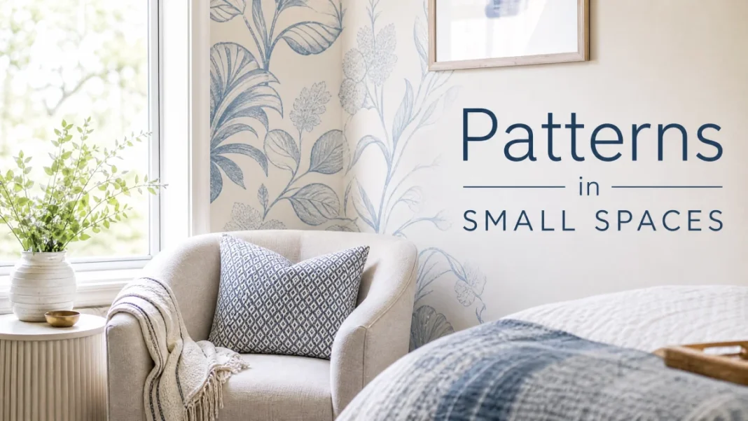
You’ve pinned a dozen serene, tone-on-tone rooms. They look effortlessly pulled together — calm, sophisticated, deeply intentional. Then you try it at home, and the room falls dead quiet. Flat beige walls. Matching beige sofa. Beige rug. Suddenly your space feels less like a curated sanctuary and more like a waiting room.
That’s the fear that stops so many people from committing to a single-color scheme. You worry that without contrast, everything will blur into nothing.
The truth? Monochromatic room design — sometimes called color drenching — is one of the most powerful, layered tools in interior styling, when you know how to build depth without leaning on color contrast. It’s not about buying everything from the same paint chip. It’s about orchestrating shade, texture, sheen, and material to create a room that reads as rich and considered. You don’t need a rainbow. You need a strategy.
The Myth That Kills the Look Before It Starts
Here’s the myth: monochrome equals boring, one-note, and flat.
The reality: a well-executed monochromatic room is sophisticated layering disguised as simplicity. It’s the design equivalent of a perfectly tailored white shirt — nothing screams luxury quite like restraint done right. Think of how Belgian designer Axel Vervoordt wraps entire interiors in plaster, linen, and bleached wood. One color family, endless depth.
The problem isn’t the single-color concept. The problem is skipping the three elements that make monochrome work: shade variation, texture layering, and material mixing. Miss those, and yes, your room will feel two-dimensional. Nail them, and you’ll get a space that feels cozy, expansive, and undeniably expensive.
1. Master Shade Variation: The Light-to-Dark Gradient
Your monochromatic palette needs to breathe. Using one flat shade from floor to ceiling is the fastest route to a lifeless room. Instead, think in gradients — moving from light to dark within a single color family. This is your primary tool for creating depth before you ever add a throw pillow.
How to build a monochromatic shade range:
- Start with your anchor shade: a mid-tone that will dominate the room, often on walls or large upholstery.
- Move two to three steps lighter on the same color strip for ceilings, trim, and large pieces you want to recede.
- Go two to three steps darker for accents, a feature wall, casegoods, or the rug that grounds the space.
Pay attention to undertones — a greige with a pink undertone will clash with a greige that skews green, even if both look “neutral” in isolation. Pull every shade from the same color strip or family, and hold physical swatches together under your room’s actual lighting before committing.
Real paint strategy
Suppose you’re building a warm greige room. You might use Benjamin Moore White Dove OC-17 on the ceiling and upper trim, Revere Pewter HC-172 on all four walls, and Kendall Charcoal HC-166 on a built-in bookcase or an accent wall behind the bed. The eye naturally moves through the tonal range, and the room gains structure without a single contrasting color.
The same logic works in any hue. A blue monochromatic room could layer Farrow & Ball Borrowed Light (pale, airy), Stiffkey Blue (mid-rich), and Hague Blue (deep, inky) on millwork. Even the smallest shift in value signals to the brain: this room has dimension.
Shade variation rule of thumb
Use the 60-30-10 rule within a single color. 60% of the room gets your lightest or mid-light shade, 30% your anchor mid-tone, and 10% your darkest value. It distributes visual weight exactly the way a traditional color palette does — just without switching families.
2. Texture Layering: The Real Antidote to Flatness
Here’s the thing designers don’t always spell out: texture is the new contrast in a monochromatic room. When every surface shares a similar hue, your eye starts hunting for tactile variation to tell pieces apart. Give it plenty to find.
Texture layering
Texture layering means purposefully mixing surfaces that reflect and absorb light differently. You want to combine soft with nubby, smooth with gritty, shiny with matte. This interplay creates shadows, highlights, and visual friction — exactly what prevents a room from falling flat.
Texture categories to mix in a monochrome space:
- Soft and plush: velvet upholstery, chenille throws, high-pile wool rugs.
- Nubby and woven: bouclé, chunky knit, raw linen, slub linen, jute, sisal.
- Smooth and hard: lacquered wood, glass, polished stone, ceramic lamps.
- Rough and organic: raw concrete, unlacquered brass, honed marble, clay pottery, woven rattan.
Imagine a cream monochrome living room. Walls are Benjamin Moore’s Simply White OC-117 in a matte finish. The sofa is a cozy ivory bouclé — nubby, light-absorbing. You add a pair of velvet accent chairs in a slightly deeper shade like Seapearl OC-19, catching the light with a soft sheen. The coffee table is a warm oak with a cerused, almost rough grain. A thick wool rug in oatmeal tones pulls everything together. Every surface feels distinct, so the room reads layered, never bland.
Designer’s trick
Imagine running your hand across every surface you select. If two large pieces feel similar to the touch — both smooth, both matte — switch one out. In monochrome, tactile contrast does the heavy lifting.
3. Material Mixing: Matte + Glossy + Rough
Texture describes how a surface feels; material mixing brings in what that surface is made of and how its inherent sheen behaves. A leather chair and a velvet pillow can be the same soft gray, but light hits them completely differently. That discrepancy in reflectivity is gold.
Key material pairings for instant depth:
1. Matte + Glossy
Pair chalky limewash walls — or a plaster finish like Portola Paints’ Roman Clay — with high-gloss trim in the same color. Try Farrow & Ball’s All White in Estate Emulsion on walls and Full Gloss on baseboards — the sheen difference alone creates definition. Glossy ceramic vases or lacquered side tables pop against matte linen bedding.
2. Rough + Smooth
Rough-hewn wood beams or a raw-edge stone mantel set against smooth, plaster-finished walls draw the eye. In a gray monochrome bathroom, combine honed marble countertops (smooth but non-reflective) with glossy, crackle-glazed subway tiles in a slightly deeper smoke shade.
3. Natural + Refined
A chunky jute rug under a sleek, polished stainless steel coffee table — both in warm earthy or silver tones — makes a statement without a drop of “color.” Even metallics count: unlacquered brass, blackened steel, or matte nickel add micro-contrast.
One-paint, multiple-sheen trick
Paint your ceiling, walls, and trim all the same color — say, Benjamin Moore’s Horizon OC-53 — but vary the sheen. Ceiling: flat. Walls: eggshell. Trim and doors: semi-gloss. The consistent hue keeps the envelope calm; the sheen shift outlines the architecture. It’s one of the best ways to achieve a high-end monochrome envelope on a budget.
Room-Specific Monochrome Schemes: Exact Shades to Try
| Room | Color Family | Shade Gradient (Light → Dark) | Texture & Material Play | Key Finishes & Notes |
|---|---|---|---|---|
| Living Room | Warm Greige | Benjamin Moore White Dove OC-17 (ceiling, trim); Edgecomb Gray HC-173 (walls); Revere Pewter HC-172 (large area rug, accent chair upholstery) | Bouclé sofa, velvet pillows in Edgecomb, a rough-linen accent chair in Revere Pewter, glass-topped coffee table with brass base. | Use matte wall paint, satin trim. Rug: a looped wool blend. Brass is your unifier. |
| Bedroom | Soft Sage Green | Farrow & Ball Mizzle No. 266 (walls); French Gray No. 18 (headboard wall); Green Ground No. 206 (ceiling) | Linen duvet in Green Ground, velvet Euro shams in French Gray, a chunky cable-knit throw in off-white with sage undertones. Nightstands in cerused oak. | Layer wall sheens: Modern Emulsion on walls, Estate Eggshell on accent wall. A honed marble lamp base adds smooth contrast. |
| Bathroom | Moody Blue | Farrow & Ball Parma Gray No. 27 (upper walls); Stiffkey Blue No. 281 (vanity, wainscoting); Hague Blue No. 30 (mirror frame, accent shelf) | Glossy crackle subway tile in Parma Gray sheen. Honed limestone countertop. Fluffy cotton towels in a mid-blue, woven rattan baskets for storage. | Use high-gloss on vanity for depth. Matte brass fixtures warm up the blue without breaking the palette. |
| Dining Room | Taupe & Clay | Sherwin-Williams Accessible Beige SW 7036 (walls); Urban Bronze SW 7048 (trim, ceiling beams); Worldly Gray SW 7043 (wainscoting) | Velvet dining chairs in Worldly Gray, a live-edge wood table with a matte oiled finish, ceramic plates with a hand-thrown rough texture. | Paint ceiling beams Urban Bronze in a flat finish; walls in eggshell. An oversized linen pendant shade softens the room. |
How to Layer It All: A Step-by-Step Sequence
- Choose your anchor color and its neighbors. Grab a paint fan deck — Benjamin Moore, Farrow & Ball, and Sherwin-Williams all offer them — and pull a strip with at least six values from light to dark. Commit to using three of them.
- Assign the lightest shade to surfaces that elevate the room — ceilings, upper trim, and large-scale millwork. It lifts the space visually.
- Place your darkest value strategically. A single accent wall, the back of a bookcase, a painted dresser. Let it ground one zone. If you spread it everywhere, you lose the pop.
- Texture-map your largest pieces. Write down the “hand feel” of your sofa, rug, bed linen, and dining chairs. Force at least three different textures. If two feel the same, swap one.
- Add sheen breaks. Grab the same paint in a different finish for trim or a focal piece. Glossy ceramics, polished stone, and shiny metals count as sheen breaks, too.
- Introduce organic materials last. Wood, rattan, clay, and stone bring subtle warmth and roughness. They’re the unsung heroes that stop a monochrome room from feeling cold.
Common Mistakes That Make Monochrome Fall Flat
1. Using Only One Value
If everything in your room sits at medium beige, your eye will have nothing to grab. You need lights, darks, and in-betweens — even within a single hue.
2. Ignoring Artificial Lighting
Light temperature changes the color you painted. A soft greige can turn icy under 4000K cool-white bulbs. Stick to 2700K–3000K warm LED bulbs for a candlelit glow that enhances tonal warmth without distorting your palette. In a cool blue room, 3000K prevents it from feeling sterile.
3. Forgetting Pattern
Monochrome rooms love subtle pattern — a tone-on-tone stripe on a pillow, a damask wallpaper in the same color as the wall, a rug with a faint geometric texture. Pattern adds visual noise that breaks up solid surfaces without introducing new colors.
4. Skipping the “Ugly” Natural Element
A raw-edge wood bowl, an unglazed clay vase, a seagrass basket — these feel essential. They provide the friction that makes the glossy and soft moments sing.
Conclusion
Monochromatic room design isn’t about restriction. It’s about creating a canvas where texture, shade, and material become the stars. When you trade color contrast for a carefully orchestrated gradient of lights to darks and a rich mix of matte, glossy, and rough finishes, your room gains a quiet confidence that feels more luxurious than any bold accent wall.
Flatness is a failure of layering, not a failure of the single-color idea. Pick three shades from one paint strip, map three distinct textures onto your largest pieces, and break the sheen at least twice. Start there. You’ll be surprised at how alive and elevated one color can feel.

