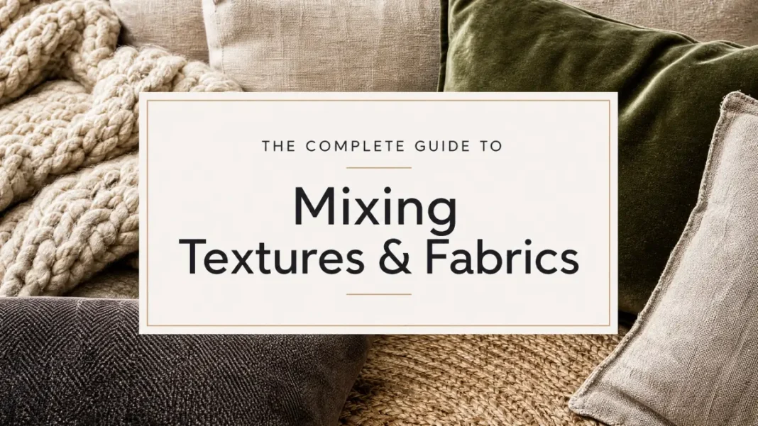
You’ve picked your paint color. Your furniture is in place. The pillows even match the rug. So why does the room still feel flat?
Nine times out of 10, it’s texture. Color gets all the attention in design conversations, but texture is what makes a room feel finished — or forgettable. A space with only smooth, matte surfaces reads sterile, no matter how good the color palette is. A space with only soft, plush fabrics reads heavy and undefined.
This guide teaches you how to mix textures and fabrics the way a designer does: with a vocabulary for what you’re seeing and feeling, one governing rule for layering them, and a room-by-room system you can apply starting today.
Most homeowners already have decent instincts about color. Far fewer have been taught to think about texture as its own design element, separate from color and pattern. Once you can name what you’re seeing — smooth versus rough, matte versus glossy — you stop shopping by accident and start shopping with a plan.
What Texture Actually Means in Interior Design
Before you can mix textures well, you need the words for them. Designers talk about texture in two ways: how something looks (visual texture) and how it feels to the touch (tactile texture). A photograph of tree bark has visual texture. The actual bark has tactile texture. Great rooms use both.
These are the core texture categories you’ll work with:
- Smooth — glass, polished stone, silk, lacquered wood. Reflects light and reads as clean or formal.
- Rough — jute, bouclé, distressed wood, raw linen. Absorbs light and reads as grounded or casual.
- Soft — velvet, wool, faux fur, chenille, bouclé. Invites touch and adds warmth.
- Hard — marble, metal, glass, ceramic. Adds structure and a sense of permanence.
- Matte — unfinished wood, cotton, plaster walls, limewash paint. Feels quiet and understated.
- Glossy — lacquer, polished brass, silk, glazed ceramic. Feels energetic and catches light.
Most rooms lean too hard on one or two of these without realizing it. A living room full of soft velvet and nothing hard or glossy will feel cozy but formless. A kitchen with only matte and hard surfaces (stone counters, matte cabinets) can feel efficient but cold.
Think about the last hotel lobby or restaurant that made you want to linger. Chances are it wasn’t just the color scheme doing the work. It was a mix — polished stone underfoot, a bouclé chair, brass fixtures, a linen-draped table. Your eye reads that variety as intentional, even if you can’t immediately name why. That’s the effect you’re recreating at home, just at a smaller and more livable scale.
Designers walk a room and touch things before they finalize a plan. Texture is the one design element you experience with more than your eyes — you feel it when you sit down, lean back, or run a hand along a countertop. A room can look balanced in a photo and still feel wrong in person if the textures don’t hold up to touch. That’s why the vocabulary in the next section matters: it gives you language for a sense most people only process instinctively.
Learn the Fabric Vocabulary: Nap, Weave, Pile, and Hand-Feel
If you want to shop for fabric with confidence instead of guessing from a photo, you need four words.
1. Weave
Weave is how the fibers are constructed — over, under, and across each other. A tight, flat weave (like poplin) feels crisp. A loose, open weave (like linen) feels relaxed and lets light filter through.
2. Nap
Nap refers to the raised fiber surface on certain fabrics, like velvet or corduroy. It has a direction, which is why velvet can look lighter or darker depending on which way you brush it or which way the seams run.
3. Pile
Pile describes the height and density of raised loops or cut fibers, most often used to describe rugs and plush fabrics. A high-pile rug feels soft and sinks underfoot. A low-pile rug feels firmer and reads more tailored.
4. Hand-feel
Hand-feel (or just “hand,” in the textile trade) is the overall sensory impression of a fabric — its weight, softness, and drape combined. When a designer says a fabric “has good hand,” they mean it feels expensive and behaves well when it’s touched or moved.
Once you know these terms, you can read a fabric swatch the way a chef reads a recipe. You’ll know before you buy whether that “linen-look” throw pillow is going to feel like the real thing or like something stiffer and cheaper.
This vocabulary also protects you from a common online-shopping trap: a fabric that photographs beautifully but has poor hand-feel in person. Product photos can’t show you weave density or drape.
When you’re shopping online, order a swatch first for any upholstery or drapery purchase over a few hundred dollars.
For upholstery, also check the double rub count — a measure of abrasion resistance — with 15,000 or more double rubs indicating fabric suitable for regular home use. A five-dollar swatch fee is a lot cheaper than a sofa that looks right in the listing photo and feels wrong the moment you sit down.
Build these words into how you talk about a room, even out loud. Instead of “I want something cozy,” try “I want a high-pile rug with a tight-weave sofa next to it.” The more specific your language, the more specific — and successful — your shopping trips become.
The Contrast Principle: The One Rule That Governs Good Texture Mixing
The rule that ties everything together: pair opposites, not lookalikes. Every texture you introduce should have at least one contrasting texture nearby to set it off.
Smooth needs rough. Soft needs hard. Matte needs glossy. This isn’t about matching — it’s about tension, the same way a good outfit pairs a structured blazer with a relaxed t-shirt instead of two structured pieces.
Example
A living room with a linen sofa (soft, matte, rough weave) gets more interesting the moment you add a glass coffee table (hard, smooth, glossy) and a chunky wool throw (soft, rough, high-pile). Now you have three textures working against each other instead of one texture repeating itself in three places.
A simple way to apply this: for every major piece in a room, name its dominant texture, then choose the next piece to contrast at least one of those qualities. If your sofa is soft and matte, your coffee table or rug should bring in something hard, glossy, or both.
Tip
Aim for 3 to 5 distinct textures per room. Fewer than three and the room feels flat. More than five and it starts to feel busy or uncoordinated, especially for readers newer to layering.
The contrast principle also explains why some rooms that follow every color-matching rule still feel off. Color harmony and texture harmony are separate systems. You can have a perfectly coordinated palette of warm neutrals and still end up with a flat room if every piece in that palette shares the same smooth, matte, medium-weight fabric. Texture is doing a job that color alone can’t do — it’s the difference between a room that reads as “coordinated” and one that reads as “designed.”
Contrast works best when it’s anchored, not scattered. Rather than adding one of everything, pick a dominant texture for the room (linen sofa, wool rug) and let two or three supporting textures play off it. A room with five competing dominant textures and no clear anchor will feel chaotic even though it technically follows the “three to five” guideline.
The Complete Fabric Guide: Velvet, Linen, Cotton, Silk, and Wool
Each fabric has its own personality, weight, and job to do in a room.
| Fabric | Hand-Feel | Best Use | Room Fit |
|---|---|---|---|
| Velvet | Plush, dense nap, catches light | Accent chairs, throw pillows, drapery | Living rooms, bedrooms, formal dining |
| Linen | Relaxed, breathable, visible slub weave | Sofas, drapery, bedding | Living rooms, bedrooms, sunrooms |
| Cotton | Crisp to soft depending on weave, easy-care | Bedding, slipcovers, everyday upholstery | Bedrooms, kids’ rooms, high-traffic areas |
| Silk | Smooth, lightweight, high drape and sheen | Drapery, pillow trim, small accents | Formal living rooms, primary bedrooms |
| Wool | Warm, dense, slightly textured hand | Rugs, throws, upholstery | Living rooms, studies, cold-climate homes |
1. Velvet
Velvet is your soft, glossy, luxury texture. Its nap catches light differently depending on the angle, which is part of why it photographs so well. Use it where you want a room to feel elevated — an accent chair, a set of pillows, or floor-to-ceiling drapery. Velvet works hardest as an accent, not a full upholstery choice, if you already have another plush fabric in the room.
2. Linen
Linen is the fabric equivalent of a great pair of dark jeans — it goes everywhere and never overdoes it. Its rough weave and matte finish make it the perfect contrast partner for anything glossy or hard nearby. Because it wrinkles and softens with use, it also tends to look better with age, which is part of its appeal for a lived-in, upscale feel.
3. Cotton
Cotton is your workhorse fabric. It ranges from crisp poplin to soft flannel depending on the weave, which makes it flexible for almost any room. It’s also the easiest of the five to clean, so it earns its keep in bedrooms and high-traffic upholstery.
4. Silk
Silk brings the most drama for the least material. A little goes a long way — silk trim on a linen pillow, or silk drapery panels in a formal living room, adds shimmer without tipping the whole room into “too much.” Because it’s delicate, save silk for low-touch, low-traffic pieces.
5. Wool
Wool is your grounding, warming texture, especially in a rug. Mohair — wool’s silkier cousin — offers a similar density with a more pronounced sheen and works beautifully in the same roles. Wool’s dense, slightly nubby hand-feel pairs well with smoother materials like glass or lacquered wood, and it holds up to years of foot traffic far better than most other options.
A note on blends
You’ll often see fabrics labeled as blends — a linen-cotton blend or a wool-silk blend, for example. Blends usually exist to soften a fabric’s weaknesses. A linen-cotton blend wrinkles less than pure linen while keeping some of its texture. A wool-silk blend adds sheen and softness to wool’s more rustic hand-feel. Blends aren’t a lesser choice — they’re often the practical answer for busy households that still want the visual benefit of a specific fabric without its full maintenance demands.
Room-by-Room Texture Guides
The contrast principle stays the same in every room. What changes is the ratio — some rooms call for more soft textures, others need more structure.
Bedroom: Lean Soft, Add One Grounding Texture
The bedroom is the one room where you can weight the mix toward soft textures — this is where comfort should win. Start with cotton or linen bedding as your base layer, add a wool or velvet throw at the foot of the bed, and bring in one hard or matte texture (a wood headboard, a ceramic lamp base) so the room doesn’t feel like it’s floating.
Tip: A tufted or upholstered headboard gives you a built-in texture contrast without adding another piece to the room — the tufting itself creates a rough, dimensional surface against smooth sheets.
If you’re starting from scratch, layer bedding the way you’d layer clothing for changing weather: a crisp cotton sheet against the skin, a linen or cotton duvet cover in the middle, and a heavier wool or velvet throw on top that you can add or remove by season. This isn’t just about texture variety — it’s genuinely practical, since it lets one bed handle both summer and winter comfort.
Living Room: Aim for the Widest Mix
This is the room where the contrast principle earns its keep, because it’s the room with the most furniture types to work with. A linen or performance-fabric sofa (brands like Crypton and Sunbrella engineer these to resist stains and UV fading) as your base, a wool or jute rug underfoot, a glass or wood coffee table, and velvet or silk accent pillows give you five distinct textures without any of them competing.
Tip: If your living room already leans heavily on soft, plush pieces, your next purchase should be hard or glossy — a metal lamp, a marble side table, a mirrored tray — not another pillow.
Throw pillows are the fastest and cheapest way to test the contrast principle before committing to bigger purchases. If your sofa is a soft, matte linen, try one velvet pillow, one woven or textured cotton pillow, and skip a third matching set entirely. Odd numbers of mixed textures almost always read better than even numbers of matched ones.
Dining Room: Balance Formal and Everyday
Dining rooms tend to default to hard textures — wood tables, hard flooring, upholstered-but-firm chairs. Soften it with fabric-covered dining chairs, a woven or jute rug under the table, and linen napkins or a table runner. If you want more formality, add silk or velvet chair cushions instead.
Tip: A wood table with metal-frame chairs is a classic contrast pairing — rustic warmth meets modern structure — and it works in almost any dining room style.
Home Office: Keep It Grounded, Add Warmth Sparingly
Home offices often skew too hard and matte — desk, hard flooring, minimal soft goods — which can make the space feel uninviting for long stretches of work. A wool or high-pile rug under the desk, a linen or cotton task chair cushion, and one soft accent (a throw on a reading chair, if you have one) balances the room without undermining focus.
Tip: Avoid heavy velvet or silk in a home office. These fabrics show wear from daily use and don’t hold up as well under constant friction from clothing and elbows.
Common Mistakes to Avoid When Mixing Textures
Even design-savvy homeowners fall into a few predictable traps. Here’s what to watch for.
- Relying on one texture across the whole room. All-linen or all-velvet feels one-note no matter how good the individual pieces are. Aim for the three-to-five-texture range from earlier.
- Overloading heavy fabrics. A velvet sofa, velvet pillows, and a velvet ottoman together reads as too much of a good thing. Swap at least one for something lighter, like linen or cotton.
- Ignoring function. Silk in a high-traffic entryway or a home with pets will show wear fast. Match delicate fabrics to low-touch spaces.
- Neglecting scale. Heavy, plush fabrics belong on substantial pieces like sofas and headboards. Save delicate textures like silk for smaller accents, not large upholstered surfaces.
- Skipping the hard textures. A room full of soft fabrics and nothing hard or glossy can feel shapeless. Even one metal, glass, or lacquered piece anchors the whole mix.
Quick self-audit
Stand in the room and name every texture you can see or touch. If you count fewer than three, or if one texture (soft, smooth, matte, etc.) shows up in more than half the pieces, that’s your sign to rebalance.
There’s also a budget-driven version of this mistake worth flagging: buying a full matching furniture set. Sets are convenient, but they’re built to match, not to contrast, which means the whole room can arrive pre-flattened before you’ve added a single accessory. If you already own a matching set, don’t panic — use the contrast principle on everything around it instead. A patterned rug, a set of mixed-texture pillows, and one hard-surface accent piece can rescue a matched living room set without replacing the furniture itself.
Conclusion
Mixing textures and fabrics isn’t about following a rigid formula — it’s about learning to see contrast the way a designer does, then applying it on purpose instead of by accident. Once you know the vocabulary and the contrast principle, you’ll start noticing texture gaps in your own rooms almost immediately.
The single most useful habit to take from this guide: before you buy anything new for a room, name the texture it’s replacing or adding, and make sure it contrasts with what’s already there. That one check will do more for your space than any single fabric or furniture choice.
Start with the room that bothers you most. Walk through it with the vocabulary you just learned, run the quick self-audit above, and see what’s missing. If you try it, we’d love to hear which texture made the biggest difference in your space.

