You’ve stared at your living room more times than you can count. You know something feels off — too cramped, too cold, or just not quite you. Maybe you’ve bought beautiful pieces that somehow refuse to play nicely together.
Every gorgeous space you’ve ever pinned, saved, or sighed over works because it respects a handful of invisible rules. Not stiff, creativity-killing rules. Think of them as the grammar of design — once you understand them, you can write your own story with confidence.
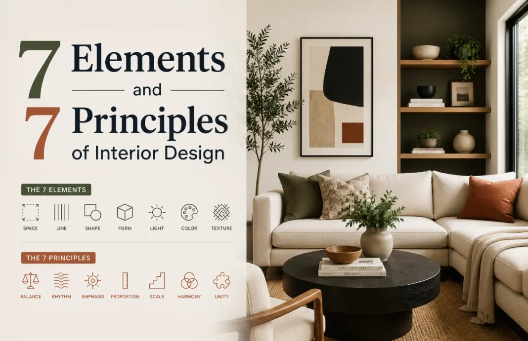
In this pillar guide, we’ll walk through the 14 building blocks that professional designers return to again and again: the 7 elements and 7 principles of interior design. I’ll define each one in plain language, show you what they look like in a real room, and point out the slip-ups I see most often (even in expensive homes).
By the end, you’ll have a complete toolkit to diagnose what your space needs, make smarter choices, and finally create a home that feels collected, comfortable, and unmistakably yours.
Let’s start with the ingredients. Then we’ll talk about how to mix them.
Part 1: The 7 Elements of Interior Design
Every room is made of seven fundamental elements. You can’t avoid them — they’re already there. The trick is learning to see them and shape them on purpose.
1. Space: The Foundation of Every Room
Space is the raw area you’re working with — the boundaries of floor, walls, and ceiling. Designers think of space in two ways: positive space (filled by furniture and objects) and negative space (the breathing room around them). Negative space isn’t emptiness; it’s a tool that lets your eye rest and highlights what you do put in the room.
How to Work With Space?
In a compact room, you’ll often need to carve out zones with furniture arrangement rather than walls. A console table behind a sofa can separate the living zone from the entryway without stealing a single square foot. In an open-concept home, a well-placed rug defines the living area as a distinct “room.” And don’t forget vertical space: floor-to-ceiling curtains and tall bookcases pull the eye up, making a low ceiling feel higher.
Think of a New York apartment that feels surprisingly expansive. Often the magic is negative space — the owners chose fewer, better-scaled pieces and left generous pathways. That restraint creates the luxury feeling.
Common Space Mistakes
- Pushing every piece of furniture against the walls. Floating your sofa even 10 inches away from the wall creates a more intimate seating group and makes the room look bigger.
- Ignoring circulation. You need at least 30 to 36 inches of clear walkway between large furniture pieces so movement feels natural.
- Treating negative space as an afterthought. If every wall is covered and every corner filled, the room feels anxious. Let a few walls breathe.
2. Line: Directing the Eye
Line refers to the linear marks and edges that guide your gaze around a room. Lines fall into three families: horizontal lines (tables, low sofas, wide artwork) suggest stability and width. Vertical lines (tall mirrors, floor-length drapes, paneling) create height and formality. Dynamic lines — diagonals, curves, arcs — inject energy and soften a space.
How to Use Line?
If your bedroom feels squat, add vertical lines. A tall upholstered headboard, vertically striped wallpaper, or a pair of floor-to-ceiling curtain panels will instantly lift the ceiling. Want your long, narrow living room to feel wider? Repeat strong horizontals: a low-slung media console, a row of same-height frames on the wall, and a linear sofa all widen the view.
Curves deserve a special shout-out. A round dining table, an arched mirror, or a curved-back chair breaks up a room full of rectangles and makes it feel more inviting. That’s why designers often place a round coffee table in a square seating arrangement — the contrast calms the geometry.
Common Line Mistakes
- One-note line direction. A room entirely built of straight horizontals (flat sofa, rectangular coffee table, blocky bookcases) feels stiff. Introduce at least one curve or strong vertical.
- Forgetting the fifth wall. Your ceiling is a plane full of line possibilities. A simple coffered detail or painted beams adds structure where most rooms have none.
- Mismatched curtain height. Hanging drapes just above the window frame creates a truncated horizontal line. Instead, mount the rod 4 to 6 inches above the trim — or at ceiling height — to pull the eye upward.
3. Form: The Shape of Things
Form is the three-dimensional shape of objects and the room itself. Forms are either geometric (sharp, man-made rectangles, squares, and circles) or organic (irregular, nature-inspired curves). The shell of a room is typically a geometric box. Layering in some organic forms keeps it from feeling like a conference room.
How to Balance Form?
Picture a sleek, rectangular sectional in charcoal velvet. It’s all straight lines and hard edges. Place a live-edge wood coffee table in front of it, and the organic slab immediately softens the scene. This geometric-meets-organic tension is the hallmark of mid-century modern design — think of the Eames Lounge Chair’s sculptural shell on its precise steel base. In a dining room with a sharp-edged table, oval-back chairs do the same work. Even accessories matter: a stack of round trays on a square ottoman, a ceramic vase with an irregular silhouette — these small moments of contrast make a room feel designed.
Common Form Mistakes
- All geometric, all the time. I see this most in fast-furnished apartments. Everything is a square or a rectangle. The space reads flat and unwelcoming. Add one organic form per zone — a round side table, a sculptural lamp, a plant with freeform leaves.
- Over-curving. A room that’s too organic (think puffy cloud sofas, circular everything, no straight lines) can feel formless. Anchor with one strong geometric piece.
- Ignoring the room’s own form. A long rectangular room begs for a long rectangular table. Place a tiny round bistro set in the middle, and the proportions fight each other.
4. Light: The Mood Maker
Light is arguably the most transformative element. It affects how every color, texture, and form reads. Designers think in three layers of light: ambient (overall illumination), task (focused light for reading, cooking, working), and accent (highlighting art, architecture, or a textured wall). A single overhead fixture gives you only ambient light — and flat, unflattering shadows.
How to Layer Light?
In a living room, start with a central semi-flush mount or chandelier on a dimmer. Add task light: a reading lamp by the sofa and a pharmacy-style floor lamp near a favorite chair. Then bring in accent light — a picture light over a large canvas, or a slim LED strip inside a bookshelf. The goal is pools of light at different heights. When all three layers are dimmed just right, the room glows.
Natural light counts too. North-facing rooms get cool, steady light that can read a little gray, so you’ll want warmer bulbs (look for 2700K–3000K on the packaging). South-facing rooms bask in warm light all day; you can lean into crisp whites and cooler tones.
Common Light Mistakes
- Relying on a single overhead “boob light.” It casts harsh top-down shadows and flattens everything. At minimum, add a floor lamp and a table lamp.
- Forgetting dimmers. Every hardwired light should be on a dimmer — Lutron Caséta is a reliable option that doesn’t require a full smart-home setup. It’s the cheapest way to make a room feel expensive.
- Mismatched color temperatures. If your recessed lights are 4000K (cool blue) and your table lamp is 2700K (warm amber), the room feels unsettled. Pick one temperature family and stick with it, or use tunable smart bulbs like Philips Hue that shift throughout the day.
5. Color: Emotion in a Can
Color is the element that gets all the attention — and it deserves it. It sets the emotional tone, alters perceived size, and ties disjointed pieces together. The color wheel groups hues into primary, secondary, and tertiary relationships, but for interior design I find it more useful to think in terms of undertone. Every color has an undertone (warm, cool, or neutral), and getting those to harmonize is half the battle.
How to Use Color With Confidence?
A foolproof beginner’s formula is the 60-30-10 rule: 60% of the room is a dominant color (usually on walls and large upholstery), 30% a secondary color (drapery, accent chairs, big rugs), and 10% an accent (throw pillows, art, small accessories). In a living room, you might do walls in a soft warm white like Benjamin Moore White Dove OC-17, the sofa in a camel leather (secondary), and accents in deep teal. That tiny 10% carries surprising weight — it’s the jewelry of the room.
When testing paint, never rely on a chip under store lighting. Paint a large poster board with your sample and move it around the room at different times of day. Undertones shift dramatically depending on light direction — what reads as a promising greige in the store can turn violet under north light.
Common Color Mistakes
- Skipping the undertone check. A beige with a pink undertone placed next to a beige with a yellow undertone looks muddy. Compare swatches side by side on a white background.
- Ceiling amnesia. The ceiling is the fifth wall. A soft color wash or even a slightly warmer white up there can make the room feel wrapped and finished. Stark ceiling white often looks like a primer coat.
- Accent-wall regret. A single dark accent wall can chop a room awkwardly. Instead, paint the entire room a mid-tone hue — it often feels more cohesive and sophisticated.
6. Texture: The Sense of Touch
Texture describes the surface quality of materials — how they look like they’d feel. It can be visual texture (a wallcovering that mimics linen) or tactile texture (actual roughness, nubby weaves, smooth glass). Rooms that feel flat are almost always missing enough texture variation. Texture adds depth without adding pattern, so it’s essential for neutral and tonal schemes.
How to Layer Texture?
Imagine a monochromatic bedroom in shades of cream. If everything is smooth — satin sheets, polished wood nightstand, glossy lamp — it feels sterile. Now swap the sheets for rumpled linen, add a chunky hand-knit throw, place a rattan tray on the nightstand, and hang raw-silk curtains. The color story hasn’t changed, but the room now feels rich and inviting. The rule of thumb: at least three distinct textures in any seating zone. A velvet sofa, a jute rug, and a hammered-metal side table already hit that mark.
Common Texture Mistakes
- Too much shine. High-gloss finishes, lacquered furniture, and metallic everything bounce light but rob warmth. Balance glossy with matte, rough with smooth.
- Forgetting texture on vertical planes. Textured wallpaper, shiplap, or even a woven wall hanging breaks up tall walls.
- Skipping the “ugly” textures. Baskets, unfinished wood, raw ceramic — these humble textures make polished spaces feel livable.
7. Pattern: Visual Rhythm in Print
Pattern is repeated decorative design — florals, stripes, geometrics, plaids, and organic motifs. It adds energy and personality, but it’s the element people fear most. The secret isn’t avoiding pattern; it’s scaling and anchoring it correctly.
How to Mix Patterns?
Stick to a color family first. Pick a palette of three to four colors, then gather patterns that share those colors. Next, vary the scale: a large-scale floral, a medium-scale stripe, and a small-scale geometric. In a single sofa setup, you might use a large ikat-print rug, medium plaid pillows, and a tiny stripe on a throw. The common colors unite them; the different scales keep your eye moving without clashing. When in doubt, a solid ground-color piece — a chair in a solid pulled from the rug — gives the eye a place to rest.
Common Pattern Mistakes
- Matching too closely. Buying a matching bedroom set with identical patterned bedding, curtains, and valance from a big-box store reads as a “room in a bag.” Break it up with solids and smaller doses of pattern.
- Ignoring pattern in a minimalist room. A subtle tone-on-tone stripe or a herringbone wood floor brings pattern in a quiet, textural way.
- Placing patterns only at eye level and below. A patterned lampshade or framed textile above the sofa carries pattern vertically.
Part 2: The 7 Principles of Interior Design
Now that you have the ingredients, let’s talk about how to arrange them. The principles are the verbs — they explain how to apply the elements so a room feels harmonious, interesting, and right.
1. Balance: The Sense of Visual Weight
Balance is the distribution of visual weight across a room. Think of a seesaw — you want both sides to feel equally anchored. There are three types: symmetrical balance (mirror-image arrangements), asymmetrical balance (different objects with equal visual weight), and radial balance (elements arranged around a central point, like a round dining table with matching chairs).
How to Achieve Balance?
Symmetrical balance is easiest and feels calm and formal — twin nightstands with matching lamps, a fireplace flanked by identical bookcases. Asymmetrical balance is more dynamic and modern: imagine a sofa with a visual-heavy gallery wall on the right side. To balance it, you’d place a tall floor lamp and a weighty armchair on the left. The objects aren’t identical, but their combined visual “pull” evens out. Visual weight comes from size, color darkness, texture roughness, and visual complexity — a small black object can balance a larger pale one.
Common Balance Mistakes
- Forcing symmetry everywhere. It can become static and predictable. Mix in one asymmetrical moment per room — an off-center piece of art or a mismatched pair of chairs.
- Ignoring height in balance. A low cabinet on one side won’t balance a tall bookshelf on the other. Use a tall floor lamp or hanging pendant to pull the weight upward.
- Not checking balance from every entry point. View the room from the doorway you use most; sometimes the arrangement looks balanced from the sofa but heavy from the entrance.
2. Rhythm: Creating Visual Flow
Rhythm is the principle that moves your eye around the room in a deliberate way. It’s created through repetition, progression, and contrast. Just like a song, a room needs a beat. Without rhythm, your eye lands on one thing and gets stuck.
How to Build Rhythm?
Repetition is the simplest tool. Repeat a color three times in a room — say, a navy vase on the mantel, navy piping on the dining chairs, and a navy abstract shape in the art. Progression uses gradation: a set of nested tables, a gallery wall with frames that gradually increase in size, or a tone-on-tone ombre curtain. Contrast creates a “pop” that punctuates the rhythm — a bright yellow cushion in a blue room acts like a drum fill.
A well-rhythmed room makes you want to walk through it. In a hallway, try hanging a series of identical frames at even intervals; that steady beat pulls you forward naturally.
Common Rhythm Mistakes
- Stopping repetition too soon. One or two repeats feel accidental. Three is the magic number that reads as intentional.
- Monotonous rhythm. Repeating the same chair in a row of six feels institutional. Repeat the same color on different objects, or the same shape in different materials.
- No rest in the rhythm. The eye needs a blank spot — a solid wall, a neutral sofa — to pause. Continuous pattern without quiet moments is exhausting.
3. Emphasis: The Focal Point
Emphasis is the principle that gives a room a clear “look here first” moment. Every room needs a star. Without it, the eye wanders, and the space feels unfocused. The focal point could be architectural (a fireplace, a picture window) or decorative (a large piece of art, an impressive headboard).
How to Create Emphasis?
If your room has a natural focal point like a fireplace, make it impossible to ignore. Paint the wall behind it a deeper accent shade, hang a striking mirror or artwork above the mantel, and arrange seating to face it. In a bedroom without architecture, the bed becomes the focal point — emphasize it with a tall headboard, dramatic bedding, or a gallery wall clustered above. In a dining room, a bold pendant light over the table draws every eye to the gathering spot.
A room can have a secondary focal point, but it should be clearly subordinate. A beautiful console vignette across from the main seating group adds interest without competing.
Common Emphasis Mistakes
- No focal point at all. The room is a sea of equally weighted beige blocks. Decide on the hero piece and make it demand attention.
- Competing focal points. A massive TV competing with a fireplace and a gallery wall. Pick one primary focus; downplay the others. Hide the TV in cabinetry or treat it as black negative space.
- Emphasizing the wrong spot. The focal point should be visible from the main entry. If you emphasize a wall only visible from a corner, the room never reads as intentional.
4. Proportion: Parts to the Whole
Proportion describes how the parts of an object or room relate to one another. Think of a coffee table: is its length roughly two-thirds the length of the sofa? That’s good proportion. Classic design often references the golden ratio (roughly 1:1.618), but you don’t need to do math. You just need to train your eye to spot when something looks “too tall” or “too skimpy” for its partner.
How to Get Proportion Right?
The classic coffee table rule: aim for a table that’s about two-thirds the length of your sofa and positioned 14 to 18 inches away from the seat edge. For a dining table, leave at least 36 inches from the table edge to the wall or sideboard so chairs can slide out comfortably. In a room with high ceilings, a standard 8-foot bookcase can look like a child’s toy. Use taller case goods or stack art vertically to bridge the vertical proportion.
Common Proportion Mistakes
- Tiny rug, big room. A postage-stamp rug under a full-size sofa makes the whole grouping feel disjointed. All front legs of the main seating should sit on the rug.
- Skimpy lamps. A petite lamp on a large console table disappears. The lampshade should be at eye level when seated near it, and the lamp base should have enough visual mass to anchor that spot.
- Art that’s too small above a piece of furniture. Over a sofa, art or a grouping should span roughly two-thirds to three-quarters the width of the sofa. A tiny 16×20 frame floating alone looks lost.
5. Scale: The Size Dance
Scale is closely related to proportion, but while proportion deals with relationships within a composition, scale refers to the size of an object in relation to the room and human body. A massive sectional can have perfect proportion internally but be completely out of scale for a 10-by-10-foot room. Scale is why you measure.
How to Master Scale?
Measure your space and map it on graph paper or a free online room planner like RoomSketcher before buying large pieces. In a small room, choose furniture with exposed legs, transparent materials (a glass coffee table), and lower profiles — they take up less visual mass. In a grand, double-height room, you’ll need substantial scale to hold its own: a large-scale chandelier, an oversized mirror, or extra-tall drapery that reads from 20 feet away.
Human scale matters too. A dining chair seat height is typically 18 inches. Coffee tables work at 16 to 18 inches high. Console tables land at about 30 to 32 inches. Stray far from those ergonomic standards, and the room feels off in ways people can’t articulate — they just know it’s uncomfortable.
Common Scale Mistakes
- Cramming an oversized sectional into a modest living room. It swallows the space and leaves no room for side tables or negative space.
- Underscaling art in a tall entryway. A single 8×10 frame on a vast wall looks like a postage stamp. Go big, or create a gallery that reads as one large mass.
- Ignoring the scale of pattern. A huge floral on a small accent chair can work as a punchy statement, but that same pattern on a large sofa overwhelms. Match pattern scale to the size of the object.
6. Harmony: The “Same Language” Rule
Harmony is achieved when all the elements and principles feel like they belong to the same family. It’s the smooth blending of colors, textures, and styles so nothing jumps out as a foreign object. A room can be eclectic and still feel harmonious if there’s a unifying thread — a recurring palette, a consistent level of formality, or a common material.
How to Create Harmony?
Choose a through-line. In a collected living room, that might be a warm, earthy palette that accepts both a vintage leather chair and a modern linen sofa. Or it might be a material story: brass accents, cane details, and creamy plaster finishes that weave through every zone. Harmony doesn’t mean matchy-matchy. It means every piece is speaking the same language — even if they’re saying different things.
Think of a room where the color story is soft blues, warm wood, and ivory. You could bring in a Persian rug with those hues, a contemporary blue abstract painting, and a traditional wingback in a blue-gray linen. The pieces span decades and styles, yet they live together peacefully. Styles like Scandinavian design and Japandi succeed at this because they rely on a tight material and color language — natural wood, muted tones, clean lines — that unifies everything without making it look catalog-ordered.
Common Harmony Mistakes
- Abrupt style shifts. A glossy white ultra-modern console next to a heavily distressed farmhouse sofa with no bridge piece creates visual whiplash. Introduce a transitional piece — maybe a sleek wooden bench — to ease the transition.
- Too much variety in wood tones without a linking element. Four different wood finishes in one open space can feel chaotic. Unify them with a shared rug color or repeated black metal accents.
- Themed-room trap. “Coastal” rooms that fill up with anchor motifs and shell-patterned fabric often lack harmony because they rely on props, not a consistent design language.
7. Unity: The Finished Feeling
Unity is the final principle — the result of getting all the others right. When a room has unity, every piece feels essential, the eye moves comfortably, and nothing tugs at you with a sense of wrongness. Unity doesn’t mean perfection. It means the space feels whole.
How to Check for Unity?
Stand in your doorway and take a photo. Flip it to black and white. Does the distribution of light and dark feel even? Do any shapes feel jarring or abandoned? The black-and-white test strips away color and reveals balance and scale issues. Next, do a “one-year” test: is there anything in the room you’d change immediately if money and effort were no object? If you can name multiple things, the room hasn’t achieved unity yet. That’s okay — unity evolves as you live in a space.
Common Unity Mistakes
- Holding onto pieces that no longer serve the room. Sentimental items that clash destroy unity. Give them a dedicated spot elsewhere in your home — a reading nook or a hallway gallery — rather than forcing them into a room they don’t suit.
- Inconsistent “visual temperature.” A room with cool gray walls, icy chrome, and one warm amber throw pillow feels unsettled. Either warm things up overall or treat the warm piece as a deliberate accent repeated elsewhere.
- Never calling it done. Constant tweaking without a cohesive goal prevents unity. Decide on your core palette, your key materials, and your focal point, then let the room rest.
Conclusion
You now have the entire playbook — from the airy negative space that lets a room breathe, to the unifying thread that ties a collected home together. The goal isn’t to memorize every term. It’s to walk into any room and ask the right questions: Where’s my eye going first? Is there enough texture? Do the scales talk to each other?
Here’s my challenge to you: pick one room in your home. Identify one element or principle that feels weakest — maybe your rhythm is flat, or your balance is lopsided — and make one intentional change this weekend. Shift a lamp, swap a pillow, hang art at the proper height. Small adjustments, grounded in these fundamentals, are how beautiful homes are built.

