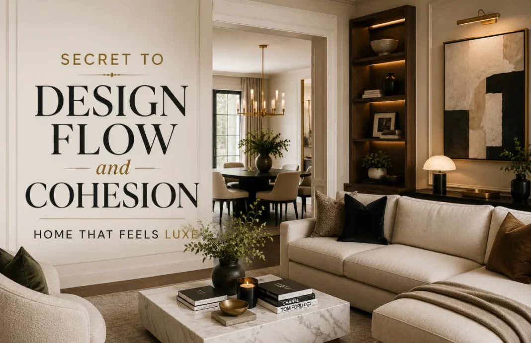
You found the perfect emerald velvet sofa. It’s show-stopping. You build the living room around it. But the moment you step back, something feels off. The sofa is magnificent, yet the room looks unsettled — like it’s fighting the beige hallway walls and the oak trim peeking through the archway.
Sound familiar? You’re not alone. Homeowners pour time and money into a single “wow” piece, only to feel deflated when the room still doesn’t come together.
Here’s what I’ve learned after more than a decade of styling homes: a statement piece can’t carry a disjointed space. What makes a home feel deeply luxurious, calm, and intentional isn’t one perfect item. It’s design flow and cohesion — a quiet, repeating rhythm of color, material, and style that guides you from room to room without a single jarring note.
I’ll walk you through the principles of visual flow, show you how to apply them step by step, and share real-home transformations where cohesion did what no hero piece ever could.
Let’s turn your home into a space that feels effortlessly expensive, without a gut renovation.
What Design Flow and Cohesion Mean?
When designers talk about design flow, we mean the visual and physical connection between spaces. It’s the feeling that one room naturally belongs to the next — not because they’re identical, but because they share a common language.
Visual cohesion is that shared language. It’s the deliberate repetition of a few core elements — a specific white paint, a warm metal finish, a consistent flooring thread — that makes your eye travel smoothly through the home rather than stuttering at every doorway.
Think of flow as the path, and cohesion as the pavement. Without both, walking through your home feels like flipping between disconnected catalog pages. With them, even a modest home can read like a curated boutique hotel.
Why Cohesion Feels More Luxurious Than Any Single Piece
Your brain craves order. When a space is visually calm and predictable, you relax into it. That’s why high-end residences and luxury hotels — think Aman resorts or a well-designed Four Seasons lobby — feel so good. They repeat a handful of materials and tones throughout. No single piece screams for attention because the whole environment is the star.
In contrast, a home with jarring shifts in color, wood tone, or style reads as chaotic. It doesn’t matter if that dining table cost a fortune; if the floor underneath it clashes with the living room floor you can see through the open doorway, the whole scene feels cheaper.
| Cohesive Home | Disjointed Home |
|---|---|
| Visual restfulness — your eye moves without interruption | Visual noise — each room demands its own attention |
| Perceived value — the entire home feels intentional and high-end | Perceived chaos — the home feels accidental, no matter the budget |
| Emotional calm — harmony reduces visual stress | Subtle unease — you can’t quite name why something feels “off” |
| Seamless flow — rooms connect, making the home feel larger | Fragmented boxes — rooms feel smaller and disconnected |
A single statement piece can sing only when the room around it is already in tune. Cohesion is what tunes the room.
The Core Principles of Visual Flow
To build a whole-home feeling of luxury, focus on three pillars: color continuity, material repetition, and style consistency. Master these, and every room will feel like it belongs to the same story.
Color Continuity
A whole-home color strategy is your single most powerful tool. Instead of treating each room as its own color island, choose 3 to 5 core neutrals that travel through the entire house. Vary them by value — lighter here, deeper there — but keep them in the same temperature family. Think of it as the classic 60-30-10 rule scaled across rooms: one dominant neutral wrapping roughly 60% of surfaces, a secondary tone at 30%, and a single accent threading through at 10%.
For example, you might wrap the main living spaces in Benjamin Moore White Dove OC-17 on trim and ceilings, use Pale Oak OC-20 on living room walls for a warm, greige envelope, and deepen to Revere Pewter HC-172 in a study or powder room. The shift feels intentional, never abrupt.
A good rule of thumb: when you stand in one room and look into the next, the wall colors should feel like cousins, not strangers.
Material Repetition
Pick two to three core materials and use them everywhere. This creates a subconscious thread that ties the house together.
Say you choose unlacquered brass for all hardware, matte European white oak for flooring, and a honed black granite or soapstone for countertops and fireplace surrounds. When these same materials appear in the kitchen, the hallway console, and the primary bath, your brain reads “curated.” You don’t need to buy expensive things — you just need to be consistent with the things you choose.
Style Consistency
You don’t have to decorate every room in identical furniture. But you do need a unifying design language. If your overall home leans transitional — clean lines, comfortable shapes, a mix of classic and contemporary — don’t drop a rustic farmhouse table into the breakfast nook. That’s not a fun surprise; it’s a visual speed bump.
The same applies whether your language is mid-century modern, Japandi, or traditional. Pick your lane and stay in it. You can absolutely play with variation. A dining room can feel a touch more formal within your transitional envelope. A family room can skew softer and more relaxed. The key is that every room still shares the same accent finish, the same neutral backdrop, and the same general silhouette language.
Transition Techniques That Connect Rooms Without a Gut Renovation
Principles are the “why.” Now let’s talk about the “how” — specific moves you can make at the thresholds between rooms to pull the whole home together.
Honor the Sightlines
Stand in the most open area of your home and note what you see through each doorway. The wall color you glimpse, the edge of a rug, the arm of a sofa — those fragments must feel connected.
One of the simplest fix is align your dominant neutral. If your entryway is painted a soft warm white, continue that white down the hallway wall you can see from the living room. You don’t have to paint the entire adjacent room the same color, but the portion in sight should share it.
Unify the Flooring
Wherever possible, run the same flooring material throughout the main level. If you have existing wood floors and new luxury vinyl plank (LVP) in the addition, at minimum make sure the tone and plank width match. A sharp shift in floor color at a doorway visually chops your home in half. If you can’t change the flooring, use a runner or an area rug in the transitional zone that picks up tones from both sides to soften the boundary.
Consistent Trim and Doors
It sounds small, but it’s transformative. Use the same baseboard height and profile, the same door style, and the same casing throughout the public spaces. Paint all trim and doors in a single crisp white, like Sherwin-Williams Pure White SW 7005, in the same sheen. Suddenly every opening feels intentional, not patched together over decades.
Lighting as a Connective Thread
Choose one metal finish for all visible light fixtures in open-plan areas, and repeat it in adjacent rooms. If your kitchen pendants are warm antique brass, let the entryway lantern and the dining room chandelier follow suit. The metal becomes a glinting breadcrumb trail that leads the eye from space to space.
The Most Common Cohesion-Breaking Mistakes (and How to Fix Them)
Even with the best intentions, it’s easy to derail your home’s flow. These are the top offenders I see — and quick fixes you can apply this weekend.
The Accent Wall Addiction
A different bold color on one wall in every room chops flow to pieces. Instead, if you love a deeper hue, commit to it on all four walls of a single contained room like a powder room or study — a technique designers call color drenching — and let the rest of the house stay calm.
Mixing Too Many Wood Tones
Oak floors, walnut dining chairs, cherry trim, espresso coffee table — together they read as a lumberyard. Limit yourself to two wood tones that share an undertone. For example, white oak floors and a slightly darker walnut for furniture work because both have warm brown bases.
Buying Room-by-Room Without a Master Plan
Furnishing one room at a time without a whole-home palette always leads to mismatch. Before you buy another piece, define your core three neutrals, one metal finish, and one unifying material (like wood flooring or stone). Shop only against that brief.
Overlooking Sightlines
The pale blue dining room may be lovely on its own, but if it glares against the greige living room you can see through the cased opening, the home feels fractured. Test all paint colors while standing in the connecting space, not just inside the room you’re painting.
Forgetting the Fifth Wall
A different ceiling color or sheen in each room is a sneaky flow-killer. Paint all ceilings in the public areas the same flat white — I often use Benjamin Moore Ceiling White — and watch the rooms link together instantly.
Your Whole-Home Color Strategy: A Step-by-Step Plan
Ready to build the thread that ties your home together? Follow these five steps, and you’ll never face a disjointed room again.
- Choose a unifying neutral anchor. This is the color you’ll use on trim, ceilings, and key connecting walls. A clean, warm white like Benjamin Moore White Dove, Sherwin-Williams Alabaster, or Farrow & Ball All White works in almost any light.
- Select two supporting neutrals. Pick a light-to-mid-tone greige or warm gray for main living areas, and one deeper neutral for accent rooms. Stay within the same undertone family — all warm or all cool.
- Designate one consistent accent color. This isn’t a wall paint; it’s a thread — a soft blue-green, a muted clay, a dusty blush — that appears in art, pillows, a rug, or a single upholstered chair in each room. Use it sparingly, but identically so it whispers “connection.”
- Lock in your metal finish. Choose unlacquered brass, polished nickel, matte black, or oil-rubbed bronze. Use it on cabinet hardware, door handles, light fixtures, and plumbing fixtures. One finish, everywhere.
- Define your flooring thread. If you can’t have identical flooring throughout, match the undertone. For example, a warm-toned engineered wood in the living room and a warm-toned LVP in the kitchen will flow far better than a cool gray tile next to a yellow oak floor.
Print these five decisions and tape them inside a kitchen cabinet. Every purchase from now on must pass the “cohesion test.”
Real Homes Where Flow Transformed the Space
Two real-world transformations prove cohesion does what no single piece can — no demolition required.
The 1990s Colonial That Finally Breathed
A client’s classic colonial had every room painted a different saturated color — a gold foyer, a red dining room, a sage family room, a blue study. The rooms were lovely individually, but walking through felt chaotic. We painted all common-area walls in Sherwin-Williams Alabaster, ceilings in flat Pure White, and kept the existing warm-toned hardwood floors consistent. We swapped out five different metal finishes for satin nickel on every door handle, hinge, and light fixture.
The result? The home felt 300 square feet larger and looked like it had undergone a high-end renovation.
Total cost: under $2,000 in paint and hardware.
The Bungalow Where the “Mistake” Sofa Became the Star
Another homeowner had fallen in love with a walnut-legged mid-century modern sofa, but the rest of the house was filled with cottage-style pieces. The poor sofa looked like it had wandered in from a different address. Instead of returning it, we repeated its walnut tone in the dining table, a console, and a round mirror frame.
We pulled a soft dusty blue from the sofa’s pillows into a runner in the hallway and a ceramic lamp in the adjacent reading nook. The sofa didn’t change. The room around it did. Suddenly it wasn’t a jarring statement piece — it was the anchor of a cohesive, pulled-together home.
Conclusion
You don’t need a trophy piece to have an expensive-feeling home. You need a quiet, consistent thread of color, material, and style that carries you gently from the front door to the back bedroom. When the backdrop is harmonious, every piece you love — from that inherited rug to the splurge-worthy pendant — gets its moment to shine.
The next time you’re tempted to buy a single showstopper first, pause.
Start with your thread. Pick your white. Choose your metal. Repeat your materials. Then add the statement piece. That’s when the magic happens.

