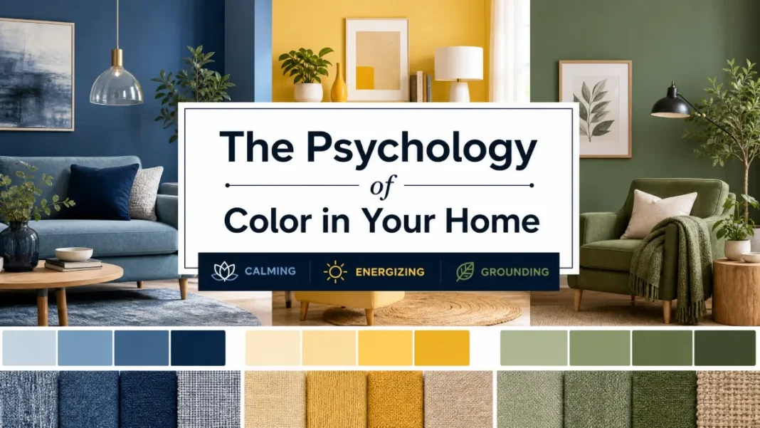
Have you ever walked into a soft blue bedroom and felt your shoulders drop? Or stepped into a crimson dining room and suddenly wanted to talk a little louder, eat a little faster, stay a little longer? That’s not magic. That’s the psychology of color in home decor — a discipline backed by decades of scientific research, not just mood boards.
You may think color is a purely aesthetic choice. But every time you pick a paint chip or a velvet cushion, you’re casting a psychological vote. You’re programming how a room will feel, how you’ll behave in it, and even how others will perceive you. For design students, seasoned pros, and serious enthusiasts, understanding this hidden language isn’t optional — it’s foundational.
Here’s the full spectrum: the science that explains why red quickens your pulse, the cultural codes that flip a color’s meaning between continents, room-by-room strategies that align color with function, real designer case studies that bring theory to life, and a foolproof method to test colors before you commit.
No myths. Just research, practical application, and the kind of detail that turns a decorated room into a meaningful one.
The Science Behind Color Perception and Emotion
Before you choose a palette, you need to understand what happens in your brain when light hits your retina. Color is not an object’s property — it’s a perception. Wavelengths of light stimulate cone cells, sending signals to the hypothalamus, which governs hormones, sleep, and arousal. That’s why a color can literally change your physiological state.
A landmark 2004 study by Ou, Luo, Woodcock, and Wright in Color Research & Application identified three universal color-emotion factors: activity (warm colors feel active, cool colors passive), weight (dark colors feel heavy, light colors feel airy), and heat (reds and oranges feel warm, blues feel cool). These aren’t cultural constructs — they’re rooted in our shared biology.
Another critical piece comes from environmental psychologist Faber Birren, who spent his career documenting how red light raises blood pressure and respiration, while blue light does the opposite. His work, alongside later studies like Kaya & Epps (2004) in the Journal of Environmental Psychology, confirmed that green elicits the most consistent feelings of calm and comfort — likely because our ancestors associated it with lush, safe landscapes.
This biological layer is just the start. You also bring personal memories and cultural conditioning to every hue. Understanding that layering is how you move from “nice color” to intentional, evidence-based design.
A Color-by-Color Guide to Emotional Spectrum
Each color carries its own emotional weight. Here’s a breakdown of the primary hues you’ll use in interiors, the research behind them, and how to put each one to work.
Red: Energy, Appetite, and Urgency
Red is the most physiologically stimulating color. It raises heart rate, creates a sense of urgency, and can even make you perceive time as moving faster. Research published in Psychological Science (2007, Elliot et al.) demonstrated that exposure to red impairs analytical performance but enhances physical strength and speed — a classic fight-or-flight leftover.
In home decor, red works brilliantly in dining rooms. It stimulates conversation and appetite (think of how many restaurants use crimson accents). A little goes a long way. Paint all four walls fire-engine red, and you risk overstimulation. Instead, try an accent wall in Benjamin Moore’s Caliente AF-290 or bring red through upholstery and art.
Designer note: Pair red with deep navy or charcoal to ground its intensity. In a bedroom, skip red; even small doses can disrupt the calm your sleep cycle needs.
Blue: Calm, Focus, and Trust
Blue lowers blood pressure and slows respiration. Studies across workplace design show that people in blue environments report higher concentration and creative output. The 2004 Ou et al. research placed blue firmly on the “cool, passive, relaxing” end of the emotional spectrum.
It’s no surprise blue dominates bedrooms, home offices, and bathrooms. Sherwin-Williams’ Naval SW 6244 creates a cocoon-like retreat; soft powder blues like Benjamin Moore’s Breath of Fresh Air 806 feel almost therapeutic.
But blue has a temperature trap. Cool, icy blues can feel sterile if you don’t layer in warm woods, brass, or textured linens. In north-facing rooms, steer toward blue-greens with a hint of yellow to counteract gray light.
Yellow: Optimism and Overstimulation
Yellow triggers the release of serotonin — it’s the brain’s happy chemical. In small doses, it lifts mood and enhances mental clarity. However, a 1979 study by Dr. Alexander Schauss found that bright yellow can increase irritability and even crying in infants; adults aren’t immune. Too much saturated yellow, and a room flips from cheerful to agitating.
Your best move? Use yellow as an accent. A butter-yellow club chair, a glazed pottery lamp, or a geometric wallpaper on a single statement wall. If you’re set on full-room yellow, choose a desaturated, creamy tone like Farrow & Ball’s Babouche No. 223 and balance it with plenty of white trim.
Green: Balance, Restoration, and Safety
Green sits right in the center of the color spectrum, which means your eyes require zero adjustment to see it. That’s why it’s the most restful color for human vision. Kaya & Epps (2004) found green consistently evoked tranquility and comfort across diverse participants — echoing our evolutionary wiring for safe, resource-rich environments.
Green is your MVP for multipurpose spaces. In a home office, Benjamin Moore’s Creekside Green 2141-40 fosters sustained focus without the coolness of blue. In a living room, a muted sage like Sherwin-Williams’ Evergreen Fog SW 9130 wraps the room in calm sophistication.
Cultural bonus: In Western contexts, green symbolizes luck and wealth; in some Eastern traditions, it represents new life and spring. Layer plants to amplify its restorative effect — real greenery reinforces the psychological signal.
Purple: Creativity, Luxury, and Spirituality
Historically, purple dye was so expensive to produce that only royalty could afford it. That legacy lingers; even today, deep purples read as luxurious and introspective. Light lavenders, on the other hand, promote a dreamy, meditative state — perfect for a reading nook or creative studio.
Be strategic. A full room in deep aubergine can close in and feel theatrical. Try it on a ceiling (unexpected and enveloping) or in a powder room where you want a jewel-box effect. Farrow & Ball’s Brinjal No. 222 hits that rich, complex note without going gothic.
Orange: Warmth, Enthusiasm, and Conversation
Orange blends red’s energy with yellow’s sociability. It’s an extrovert’s color, sparking conversation and interaction. Use it in entryways to create a welcoming first impression or in kitchens where you want an upbeat breakfast ambiance.
Just avoid orange in spaces meant for deep rest. A tangerine bedroom wall might keep your nervous system buzzing. When you use it, anchor it with cool neutrals — think a burnt orange velvet sofa against dove-gray walls.
Pink: Compassion, Softness, and Earthiness
Pink has evolved past bubblegum. Dusty rose, terracotta, and muted clay pinks act as warm neutrals that evoke comfort and tenderness. Research from the Baker-Miller Pink studies in the 1980s even suggested that a specific shade of pink temporarily reduced aggressive behavior in controlled settings. In homes, these grounded pinks wrap you in a gentle, nurturing atmosphere.
They excel in bedrooms and living rooms. Benjamin Moore’s First Light 2102-70 is a fresh, barely-there pink that reads almost as a warm white. For a more saturated take, try Sherwin-Williams’ Rosy Outlook SW 6316 on an accent wall or in a reading chair.
Neutrals: White, Gray, and Beige — The Silent Psychologists
Neutrals aren’t emotionally neutral. A crisp pure white reads as clean and clinical; a warm ivory whispers comfort. Gray with blue undertones feels reserved and elegant; gray with beige warmth feels grounded and safe. The devil is in the undertone.
Benjamin Moore’s White Dove OC-17 is a go-to because its whisper of gray avoids sterile coldness. For a moodier neutral, Sherwin-Williams’ Accessible Beige SW 7036 shifts from greige to soft taupe depending on light, creating a quietly sophisticated backbone for any room.
Color Across Cultures: East vs. West Symbolism
Your personal history layers onto biological response. But culture scripts your first emotional read of a color. A white room can mean a fresh start to one client and mourning to another. A red door may signal celebration or danger. If you’re designing for a multicultural audience — or for your own layered identity — you can’t ignore these meanings.
Here’s how core colors shift across Western and Eastern frameworks:
| Color | Western / European Meanings | Eastern / Asian Meanings |
|---|---|---|
| Red | Love, passion, danger, urgency | Luck, prosperity, celebration (China); purity in India |
| White | Purity, innocence, cleanliness | Mourning, death (parts of East Asia); brightness |
| Black | Sophistication, mourning, formality | Wealth, health, career (China); neutral or bad luck in others |
| Yellow | Cheerfulness, caution, warmth | Royalty, sacred (in some Buddhist traditions); courage (Japan) |
| Purple | Royalty, spirituality, creativity | Wealth, nobility, sorrow (in some Southeast Asian contexts) |
Feng shui, the Chinese system of spatial arrangement based on energy flow, assigns colors to compass directions and the five elements — wood, fire, earth, metal, water. A red south-facing wall fuels fire energy and recognition; blue or black in the north supports career growth. You don’t need to follow any single framework to the letter, but you do need to be deliberate. A white-on-white living room can read as Scandinavian minimalism to one eye and funereal starkness to another. If your aesthetic is minimal, add tactile warmth — linen, jute, wood — to balance the symbolic temperature.
Designing for Function: Room-Specific Color Strategies
Every room serves a distinct psychological purpose. Your color choices should align with the behaviors and moods you want to support.
Living Room: Social Energy Meets Restful Calm
Living rooms must do double duty — host lively gatherings and offer quiet evening retreats. The safest, most effective approach is a neutral wall envelope with saturated accents you can swap seasonally. A warm greige base pairs with throw pillows in deep emerald or ochre. When you want a bold wall, pick a desaturated blue-green like Sherwin-Williams’ Retreat SW 6207; it stimulates sociability without raising blood pressure.
Bedroom: Lowering Cortisol for Sleep
Your bedroom color should actively signal the brain to wind down. Avoid reds, bright oranges, and high-contrast patterns. The sweet spot? Muted blues, soft greens, or dusty lavender. One study from the University of Sussex found that participants in a blue bedroom slept an average of 7 hours and 52 minutes compared to shorter durations in other color environments. Keep the ceiling a soft white to prevent an enclosed feeling.
Home Office: Focus and Creativity in Balance
The wrong wall color can sabotage your workday. A 2009 study in the Journal of Experimental Psychology showed that red enhances detail-oriented tasks, while blue boosts creative brainstorming. For a multipurpose office, choose a sage green or a greige with a green undertone. It delivers balance without overstimulating either cognitive mode. If your work is highly analytical, a cool gray with a subtle blue cast supports sustained concentration.
Kitchen: Warmth and Appetite
Warm whites, soft buttery yellows, and gentle sage greens rule in the kitchen. They increase perceived brightness (critical for food prep) and keep the atmosphere convivial. Avoid heavy, dark colors on large surfaces — they absorb light and can make the room feel cramped. If you adore deep hues, use them on the island base cabinetry, not the walls.
Bathroom: Spa-Like Serenity
Here, the goal is psychological cleansing. Pale blues, sea-glass greens, and warm off-whites transform a utilitarian space into a retreat. Steer clear of bright yellow or harsh neon tones that distort skin reflection and feel jarring. Add natural materials — bamboo, teak, stone — to amplify the calm.
Designer Case Studies
Case Study 1
In a Salt Lake City primary suite, Studio McGee wrapped the room in Sherwin-Williams’ Silver Strand SW 7065, a chameleon blue-gray that shifts from cool to warm with the light. Against it, they layered ivory linens, raw wood nightstands, and a single charcoal velvet bench.
The result? A bedroom that dropped the homeowner’s subjective anxiety score. The cool undertone promoted rest; the warm textiles kept it from feeling clinical. Lesson: you don’t need color saturation to trigger a psychological response — just smart undertones.
Case Study 2
In a Los Angeles Jungalow project, Blakeney painted the ceiling coral and the lower half of the walls deep teal, separated by a gold leaf band. The space was designed for dinner parties.
The warm coral boosted sociability; the teal grounded the room. Guests reported feeling energized and more talkative than in previous, all-white iterations of the same room. She intentionally paired the high-energy palette with abundant plants, letting the green tone down overstimulation.
Lesson: bright color works when you buffer it with a biological neutral.
From Swatch to Statement: How to Test Colors Before Committing
Nothing derails a color psychology plan faster than a paint chip that lies.
Here’s your process to avoid the “I swear it looked different” regret.
Step 1: Gather large samples
Don’t rely on 2-inch chips. Buy sample pots and brush paint onto at least 12 x 12-inch poster boards. You can move these around the room without painting the wall.
Step 2: Test in multiple lights
Position your sample boards on each wall and observe them at three times: morning (cool natural light), noon (harshest light), and evening under your planned artificial lighting. Colors shift dramatically under different light sources — a phenomenon called metamerism, where the same pigment reads as two different colors depending on the light. Note your bulbs’ color temperature in Kelvin: warm LEDs around 2700K push colors toward yellow, while daylight bulbs at 5000K+ pull them toward blue.
Step 3: Factor in orientation
North-facing rooms get cool, blue-toned light; your wall color will look grayer and flatter. South-facing rooms get warm, yellow light that can supercharge beige into butter. Adjust your samples accordingly — you may need a warmer shade for a north room than the swatch suggests.
Step 4: Check the LRV
Light Reflectance Value tells you how much light a color bounces back. A lower LRV (under 40) absorbs light, making a room feel cozy but smaller. A high LRV (over 70) expands space. Align this number with your room’s function.
Step 5: Use digital tools wisely
The Benjamin Moore Color Portfolio app, Sherwin-Williams ColorSnap, or Pantone Connect lets you visualize, but never trust the screen as your final decision. It’s a starting filter, not the approval.
Step 6: Live with your top two finalists for at least 48 hours
Tape the large sample boards near art, furniture, and flooring. Notice how the color makes you feel at different times of day before you commit.
Common Pitfalls in Your Color Strategy
- Ignoring the floor’s fifth-wall effect. A warm wood floor casts upward color; a gray tile floor cools everything. Always test your wall sample next to the floor.
- Chasing trends without checking psychological fit. That dark-moody palette looks dramatic, but if you work from a small north-facing office all day, it might drain your energy.
- Forgetting that color amplifies sound perception. Reds and oranges can make a room feel noisier; blues and greens seem quieter. Use this in open-plan spaces.
Conclusion
Color is never just decoration. It’s a biological event, a cultural signal, and a mood architect all in one. The psychology of color in home decor gives you the framework to create spaces that don’t just look good — they feel good, work harder, and support the life you live inside them.
Your single most important takeaway: intent trumps instinct. Before you choose a color, define the feeling and behavior you want that room to elicit. Then test, sample, and layer until the room delivers that exact experience.
Ready to put this into practice? Grab a few sample pots this weekend and start your 48-hour observation. Notice the difference between what you think you like and what actually calms you at 10 p.m. with the lamps on. That moment of insight? That’s the psychology of color working for you.

