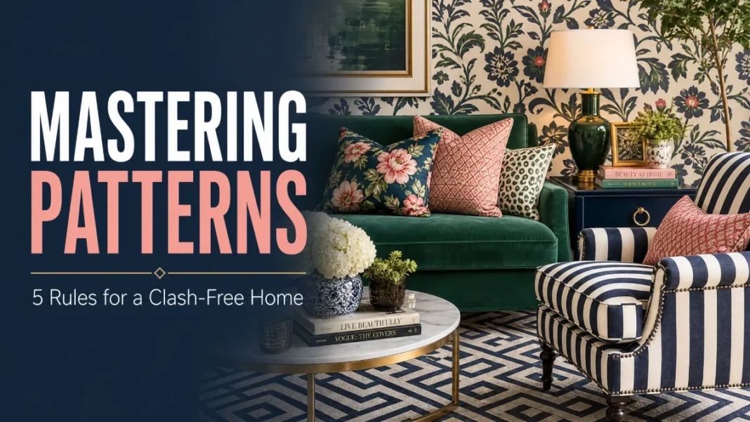
You’ve pinned dozens of living rooms where stripes cozy up to florals and a geometric rug anchors everything perfectly. Then you try it yourself—and the result feels more like a carnival than a calm, collected space. I get it. Mixing patterns can feel risky, but when you know a handful of designer rules, it stops being a guessing game and starts being the most fun part of decorating.
Here’s the secret: the rooms that look effortlessly layered almost always follow the same five principles. They aren’t complicated, and they don’t require an art degree. They guide your eye through variety and give your brain a place to rest. I’ve used these rules for years in my own projects and in the homes I’ve styled, and they work every time.
In this guide, you’ll learn the 5 rules of pattern mixing—varying scale, sticking to a tight color family, mixing pattern types, using a solid buffer, and working in odd numbers. You’ll see real examples with specific pattern names, walk through a room-by-room application guide, and fix the most common mistakes people make.
By the end, you’ll have a clear path that starts small and builds up to a home that feels collected, curated, and unclashable.
The 5 Golden Rules of Pattern Mixing
These rules are your foundation. Think of them as a checklist, not a straitjacket. Once you understand each one, you’ll naturally start reaching for combinations that feel cohesive rather than chaotic.
1. Vary the Scale
Scale refers to the size of a pattern’s repeat—how big or small its motifs appear. A large-scale pattern typically has a repeat of 12 inches or more, while a small-scale pattern repeats every 1 to 3 inches. The quickest way to create visual calm is to mix one large-scale, one medium-scale, and one small-scale pattern. When everything shouts at the same volume, nothing stands out, and the room feels loud. When scales contrast, each pattern gets its own voice.
In practice, you might pair a large-scale floral on a sofa, a medium-scale plaid on an accent chair, and a small-scale stripe on a throw pillow. The floral sets the stage, the plaid adds structure, and the stripe acts as a bridge. This technique works because your eye can separate the layers. It never has to work hard to decipher where one pattern ends, and another begins.
- Try this combo: a bold damask wallpaper (large, ornate repeat), a herringbone wool rug (medium, V-shaped zigzag), and a ticking stripe pillow (small, simple lines). The damask anchors the room, the herringbone grounds it, and the stripe keeps things fresh.
2. Unify with a Tight Color Family
Color is the glue that holds disparate patterns together. The best designers pull from a deliberately narrow palette—often just two to three hues, plus neutrals. You don’t need every pattern to match exactly; you need them to share a common color story. When each piece contains at least one recurring shade, the overall look reads as intentional. Pay attention to undertones—a warm-toned pink stripe won’t sit well next to a cool-toned pink geometric, even if the colors look similar at first glance.
Start by pulling out a single thread from your hero piece. If your floral curtain has a dusty blush pink in the petals, find a stripe that carries that same pink. Add a geometric pillow in a coordinating terracotta or warm ivory. The result feels layered, not loud. This rule lets you combine wildly different pattern styles without ever clashing.
- Pro move: Use a toile (a detailed single-color scenic print) as your color anchor. A blue-and-cream toile on a duvet cover can effortlessly support a blue pinstripe sheet set and a small-scale ikat (a tie-dyed thread pattern with soft, blurred edges) lumbar pillow in indigo and ivory. Because the blue remains constant, the mix feels serene.
3. Mix Pattern Types: Stripe + Floral + Geometric
This rule is your foolproof recipe. Choose patterns from three distinct categories: an organic motif (floral, botanical, or toile), a linear design (stripe, plaid, or herringbone), and a geometric (hexagon, chevron, lattice, or polka dot). When you combine one from each bucket, you create a dynamic trio that’s balanced and visually interesting.
Organic patterns bring softness and movement. Linear patterns add structure and direct the eye. Geometrics inject modern energy. Together, they create a rhythm that feels sophisticated, never chaotic. I always tell clients to imagine this trio as a conversation—three friends with different personalities who still get along beautifully.
- Real-world combo for a living room: a floral linen curtain in soft sage and ivory, a wide stripe on a jute-blend rug, and a hexagon-motif pillow in ochre and cream. The floral curves are tempered by the stripe’s straight lines, while the hexagon adds just enough edge.
4. Anchor with a Solid Buffer
A solid buffer means weaving in areas of plain, restful color between patterns. Without these visual pauses, even the best pattern mix can feel relentless. Solids give your eye a place to land and let your patterns breathe. They’re the unsung heroes of every well-layered room. Textured solids—think linen, bouclé, or raw silk—add depth without introducing new patterns.
Think of a solid-colored sofa, a chunky knit throw, or a crisp white tablecloth as neutral territory. You can layer patterned pillows on that solid sofa, or place a graphic tray on that plain tablecloth. The solid element separates busy pieces so they don’t compete. This single move can rescue a room that feels “too much.”
- Try this: A navy velvet sofa topped with two floral pillows, one stripe lumbar pillow, and a small-scale geometric square. The navy acts as a quiet canvas. Remove the sofa’s solid color, and those pillows would start to argue. Keep it, and they harmonize.
5. Odd Numbers Work Best
Odd-numbered groupings—three, five, or seven patterns in a room—create an organic, curated feel. Even numbers tend to look too formal or symmetrical, which can make a space feel stiff rather than lived-in. Odd groupings draw your eye around the room in a more natural, meandering way.
This doesn’t mean you must count every print on every shelf. Focus on the largest pattern players: window treatments, rugs, upholstery, bed linens, and major pillows. If you have three distinct patterns in a space, you’ve hit the sweet spot. If you want to go richer, aim for five, but always ensure they follow the scale and color rules above.
- Living room example: a large-scale floral on drapes, a medium-scale wide stripe on an ottoman, and a small-scale dotted geometric on a throw pillow. That’s three. Add a solid-buffer sofa and a neutral rug, and the room sings.
Room-by-Room Pattern Mixing Guide
Now that you have the rules, let’s walk through how to apply them in real rooms. Each space gets a specific formula you can copy or tweak.
Living Room
The rug is often the largest pattern commitment in a living room, so let it lead. Choose a rug in a pattern you love—something like a distressed geometric or a subtle floral medallion. From there, layer in two to three patterned pillows on a solid sofa. Use the organic+linear+geometric rule: perhaps a small-scale botanical print pillow, a stripe, and a dotted or chevron geometric.
Drapes can remain solid if the rug is busy, or you can go for a large-scale floral in a coordinating color. Add a solid throw blanket to the sofa as a buffer. This formula works for any style, from traditional to boho to modern farmhouse.
Bedroom
In a bedroom, your duvet cover or quilt is the focal pattern. Pick something you love—a painterly floral, a bold ikat, or a classic toile. Then choose a second pattern for shams or a folded quilt at the foot of the bed. A striped flat sheet peeking out from the duvet cover counts as your third pattern and introduces that all-important linear element.
Keep the headboard solid or textured. A single lumbar pillow in a small-scale geometric across the center of the bed adds an odd-number fifth pattern while leaving plenty of solid space to rest your eyes. This approach feels layered but never frantic.
Dining rooms are made for pattern because they’re used for gathering, not lounging—which means you can push the envelope a little. Start with patterned curtain panels, maybe a damask in a moody color. Pair them with dining chairs upholstered in a solid or a small-scale stripe. Then introduce a third pattern via a table runner, a large ceramic bowl with a hand-painted geometric border, or even a gallery wall of botanical prints.
The solid wood tabletop acts as your buffer, and the chair seats provide your mixed scales. Because the patterns are on vertical surfaces and a horizontal table layer, they never feel piled up. It’s drama without the mess.
Common Pattern-Mixing Mistakes (and How to Fix Them)
Even with good rules, things can go sideways. Here are the most common missteps I see and how to correct them.
Mistake: All patterns are the same scale.
Fix: Swap out one piece. If everything reads as medium, introduce a clear large-scale item—like oversized floral drapes or a large-check throw—and a tiny-scale accessory, such as a mini-gingham napkin or a pencil-stripe cushion. Once you add that range, the room settles.
Mistake: Too many high-contrast color stories.
Fix: Pull back to a single color anchor. Choose one hue (say, olive green) and make sure every pattern in the room includes some version of it—olive, sage, khaki, forest. The common thread unifies disparate prints.
Mistake: Forgetting the solid buffer.
Fix: Add at least two substantial solid elements right away. A solid rug, a large solid throw, or plain upholstered dining chair cushions work well. If you’re not sure where to insert solids, place one between any two patterns that are touching.
Mistake: Over-relying on one pattern type.
Fix: If you have three florals in a room, swap one for a stripe and another for a geometric print. Use the pattern-type rule as your editor. A room that’s all soft curves can look unfocused; adding a linear element gives it backbone.
Build Your Confidence: Start Small and Scale Up
I never ask a pattern-shy client to redo an entire room overnight. Instead, I give them a staircase. You’ll start with a single, can’t-fail pairing and add from there only when it feels right.
Here’s your progression.
Step 1 – Start with one hero pattern
Pick something you truly love—a pillow, a scarf you could frame, a piece of fabric you’d like to turn into a table runner. This is your North Star. Note its colors and scale.
Step 2 – Add a second pattern in a different scale and type
If your hero is a large-scale floral, add a small-scale stripe or a medium-scale herringbone. Ensure they share at least one color. Place them near each other—pillows on a bench, a tray with a striped linen napkin next to a floral vase—and live with them for a few days.
Step 3 – Introduce a third pattern to complete the trio
Choose a geometric or an abstract dot in a scale that’s different from the first two. This is your finishing move. At this point, you’ve built a small, no-fail pattern story.
Step 4 – Expand to a focal wall or upholstered piece
Once that trio feels like second nature, bring the combo into a larger application. A pair of curtains in your floral, a striped chair, and a geometric ottoman. Because you’ve already trained your eye, this step feels like a natural evolution, not a leap.
Step 5 – Add a surprise fourth or fifth pattern
Follow the odd-number rule and keep everything in the same color family. Maybe a tiny dot pillow, or a subtle plaid blanket. At this point, you’ll look around and realize you’ve created the layered, intentional space you’ve always wanted.
Conclusion
The biggest shift happens when you stop seeing patterns as potential chaos and start treating them like a design formula. Remember the five rules: vary scale, unify with color, mix organic-linear-geometric types, anchor with solid buffers, and group in odd numbers. They’re your roadmap out of fear and into a home that feels deeply personal.
Your eye is already better than you think. Reading this means you have good taste and a desire to get it right. Now, all you need is to practice. Start today with two pillows and a throw. Swap one item that’s the wrong scale. See how quickly the room transforms.
I’d love to hear which rule surprised you most or what pattern combo you’re dying to try. Tag us on social @obviousluxe or leave a comment below—let’s celebrate your first fearless mix.

